Public Tech Studio is the parent brand and the default theme. Lagos Ferry Map is a product theme under it — add data-theme="ferry" to a subtree and the chrome goes navy and cards switch to MD3 elevation. Shape does not vary by theme — 3.2px everywhere. Adding a future product means adding one theme scope, not a new system.
21components·2themes·1typeface·1radius·0gradients
Flat, never gradient
Photographs take a flat veil. There is no backdrop-filter anywhere.
Violet-tinted neutrals
Flat greys make the whole system look like a different company.
Cards lift, 2px, 300ms
The most repeated gesture in the brand. A card that does not lift reads as broken.
Foundations
Colour
One accent, two neutral families, and a three-colour signature. Hierarchy inside text is opacity of the ink colour — 80% body, 70% ledes, 60% fine print — never extra colour tokens.
{{ p.name }}
{{ p.note }}
{{ s.n }}
{{ s.t }}
{{ s.v }}
Foundations
Typography
Lato, and only Lato. Two registers coexist and must not be mixed within one surface: marketing headings are heavy and centred, product headings are regular weight and left-aligned. A 45px ferry headline at weight 400 is correct and deliberate.
{{ r.s }}
{{ r.n }}
{{ r.spec }}
Tracking
0.1px on 14px pill labels
0.025em on 12px overlines
Opacity hierarchy
80% — body copy
70% — ledes, card descriptions
60% — fine print
Foundations
Spacing & layout
A 4px scale with a very regular section rhythm: 64px vertical padding rising to 96px from lg up, inside an 80rem column. Sections alternate white, #FBFAFF, and a 30% wash of surface-variant — never two adjacent sections sharing one.
{{ r.t }}
{{ r.v }}
Measures
80rem marketing column 64rem data tables 56rem body copy 48rem ledes
Fixed chrome
64px nav / app bar 40px studio logo 6px brand rule 256px card media
Stacking
z-50 studio nav z-900 map controls z-5000 ferry app bar z-9999 dialogs
Foundations
Shape
One radius, system-wide: --radius is 0.2rem = 3.2px. Cards, images, buttons, nav items, inputs, dialogs, panels, data containers and map controls all take it, on both themes. This is the single easiest thing to get wrong: do not round it up to 8, 12 or 16px. The only fully round shapes are the chip family.
3.2px
container
--radius-container
3.2px
control
--radius-control
3.2px
ferry container
--shape-container
pill
chip family
--radius-chip
Chips, status badges, the mobile drag handle and circular icon buttons are the only round shapes. The ferry product's old MD3 scale — --radius-md-sm through --radius-md-xl — is retained as aliases that all resolve to --radius.
Foundations
Elevation
Depth is shadow only. There are no inner shadows and no rings anywhere. The studio uses Tailwind's scale and lifts cards; the ferry product uses MD3's two-part elevation and never transforms.
--shadow-sm
--shadow-md · card
--shadow-lg · hover
elevation-1 · ferry
elevation-2 · hover
Foundations
Motion
The studio has an entrance vocabulary and one signature; the product has almost nothing. Transitions are 200ms on colours and shadow for chrome, 300ms ease-out for the card lift. Never on all.
Section headers fade, prose slides up, cards scale in.
The signature
The 6px nav rule travels blue → green → yellow twice over the document height, interpolated in RGB. Scroll this page to drive it. Keep it 6px, keep it smooth.
ferry-sail
A 5s loop that enters fast, decelerates, pauses at the jetty, then accelerates out. That pause is the whole idea. bob floats 8px at 2s.
Foundations
Iconography
Lucide, and only Lucide: stroke-based, 2px weight, always currentColor. One family on every surface — marketing, product chrome and product editorial alike. Never mix in a second. No emoji, and no Unicode characters as icons.
The two Material sets the ferry codebase shipped are retired; each glyph maps to its closest Lucide equivalent. components/icons/Icon.jsx ships that mapping, so prototypes stop re-deriving path data.
{{ i.n }}
{{ i.was }}
Components
Every demo below is scoped to the theme selected in the header. Switch to Ferry to see the same components take navy chrome and MD3 elevation — shape stays constant, and no variant flags are involved.
Button
components/core/Button.jsx
Near-square on every theme, 3.2px. Verb-first labels that name the destination. Never "Learn more".
variant: filled | inverse | outline | text · size: sm | md | lg · icon · trailingIcon · href · as · disabled · fullWidth
Card
components/core/Card.jsx
White, 3.2px radius, shadow-md, 24px padding, no border — and it lifts 2px to shadow-lg over 300ms ease-out. Hover them. Under the ferry theme the same component keeps its shape and takes MD3 elevation instead, and does not transform.
With cover media
A cover image runs full-bleed at 256px above the padding box.
Plain card
An internal 1px hairline is the only border a card gets — it separates the label row from the body.
the only hairline
media · mediaAlt · padding (24 default, 16 dense) · lift · href · as
Badge & Pill
components/core/
Badge is a 15% tint of a status hue behind bold 12px text, and status hues encode state — never decoration. Pill is the neutral content chip used for destination tags.
Charter onlyFuture OMI EKOLess developedNeutralCMSIkoroduBadore
Badge tone: charter | planned | degraded | neutral · Pill takes children only
Spinner
components/core/Spinner.jsx
A 2px blue ring with a transparent top edge — the only loading indicator in the system. Messages are sentence case.
Loading map…
Loading routes…
size (16 inline, 14 in floating chips) · message
SectionHeader
components/marketing/SectionHeader.jsx
The centred opener at the top of every marketing section: 48px bold Title Case heading, two or three words, over a 20px lede at 70% ink on a 48rem measure.
Open Data Projects
We create public data products and technology solutions to inform decision-makers across Africa.
title · lede · align: center | left
LabelChip
components/marketing/LabelChip.jsx
Capability chips on project cards, and the only fully round shape in the studio theme. Six hues, uppercase 12px semibold on Tailwind's 100/700 pairs.
Field data collectionOpen dataData pipelinesMappingAnalysisTraining
tone: blue | green | purple | orange | teal | rose
ServiceCard
components/marketing/ServiceCard.jsx
A solid blue cap carrying a 32px Lucide icon and the title, over a white description well. Descriptions are one clause, no full stop.
Field Data Collection
Enumerators, instruments and quality control for primary data gathered on the ground
Data Engineering
Data pipelines, automations, and APIs that streamline data processing and publishing
Analysis and Visualisation
Maps, dashboards and reports that make a dataset legible to decision-makers
icon (32px Lucide, white) · title · children
FeatureCard
components/marketing/FeatureCard.jsx
A flat blue field with a photograph at 30% beneath an 80% blue veil, 48px padding, white copy, inverse button. The only place stock photography appears.
Our Open Data Projects
We run our own projects to close information gaps in Africa's fast-changing urban landscape.
title · children · image (30% under an 80% veil) · action · padding (48 default)
ProjectCard
components/marketing/ProjectCard.jsx
Cover image, title with the action on the same line, tagline, then a hairline and capability chips. The studio's work is its illustration — these covers are real product screenshots, and alt text describes the graphic, not the project. Unreleased work gets a grey "Coming soon" rather than being hidden.
The identity's one piece of motion, and the thing people recognise. It is live at the top of this page — the swatches below pin it to fixed positions instead.
live · progress {{ rulePct }}
rgb(66,133,244)
rgb(34,197,94)
rgb(255,235,59)
progress (0–1, pins the colour) · height (6, do not thin it) · scrollTarget · cycleColor() · useCycleColor()
SiteNav & AppBar
components/marketing/ · components/navigation/
Both navs are sticky and 64px. The studio's is white with the brand rule as its bottom edge and bold 14px links — heavier than you would expect at that size. The product's is navy with 3.2px nav items and an 8% state layer, and Lagos Ferry Map has no wordmark: its name is plain Lato 700 at 22px.
SiteNav: logo · links[] · action · scrollTarget — AppBar: title · links[] · activeHref
Accordion
components/navigation/Accordion.jsx
Editorial rows: a 24px Lucide icon, a 20px regular-weight title, a hairline divider, and a chevron rotating 180° over 200ms. Honesty is a house style — the ferry About page ships "Limitations" as its first item.
{{ row.body }}
items[]: title · icon (24px outlined) · children — defaultOpen (-1 = all closed)
Footer
components/navigation/Footer.jsx
Dark footer with an 8% white state layer on hover, closing on the black studio-credit strip. Every ferry page ends with the studio's standing invitation — keep the question mark.
Lagos Ferry Map
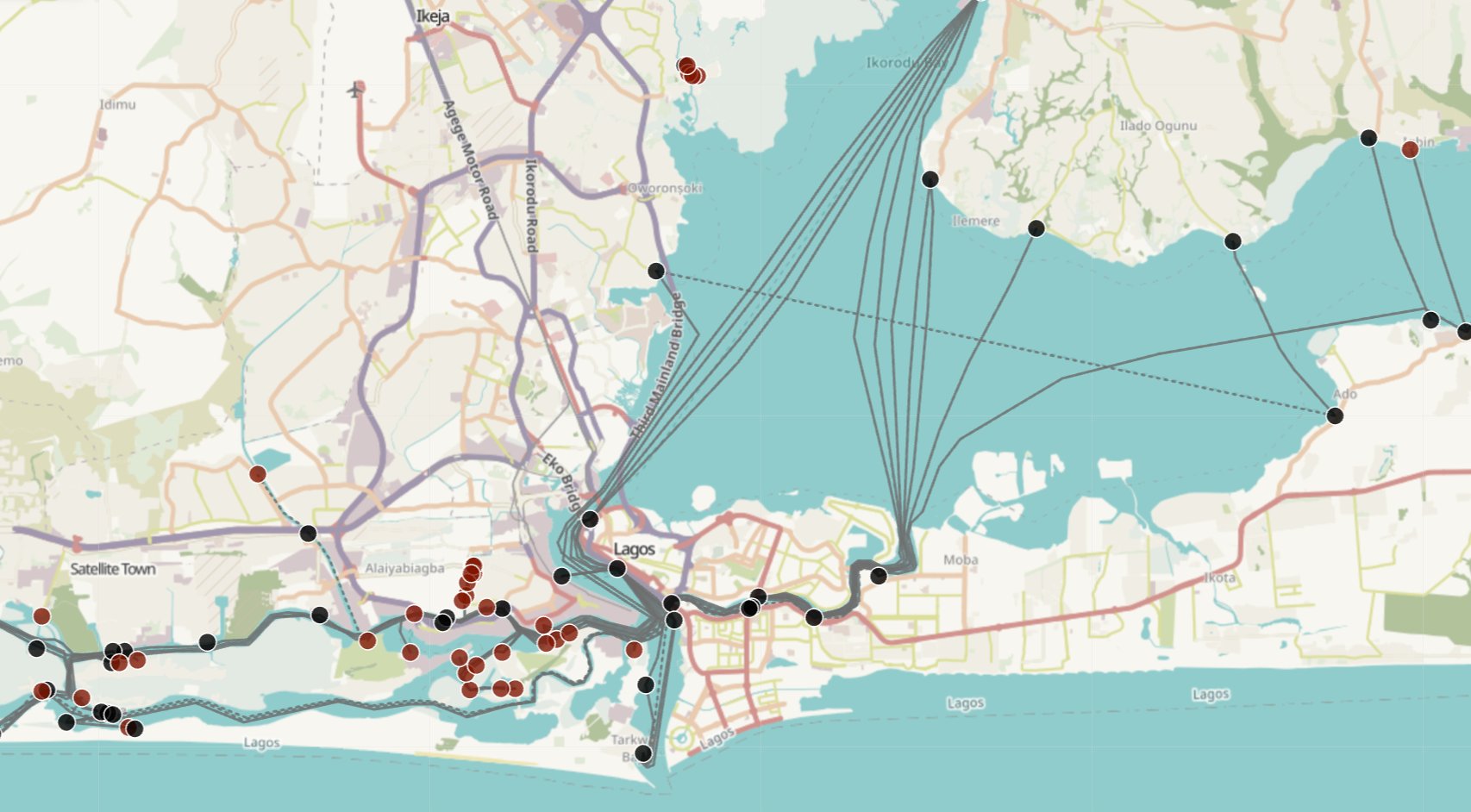
The first comprehensive map of every ferry route, terminal, schedule and fare in Lagos.
The inverse of a card: same 3.2px radius, a 1px outline, no shadow, rows divided by that outline at 60% under a sticky header. Column headers are 12px uppercase, cells sentence case, missing values an em dash. Empty states are full sentences.
StatRow is the inline count summary under a page title — bold count, muted noun, interpunct separators, each linking to the section it describes. Tooltip is solid ink at 12px, attached to a 14px info icon, wrapping at 220px.
Generalised from the Map App Template's layer panel and record/downloads screens, so any config-driven map or dataset app draws from the shared library rather than one-off markup. LayerToggle pairs a switch with an optional click-triggered info tooltip and a legend slot; Legend renders swatches, line keys, a gradient ramp, or a plain note to match how the layer is actually styled.
Dialog is a centred modal on a 40% black scrim — titles are questions in sentence case. Panel is the map detail record: half-width with a 1px left edge on desktop, a two-thirds-height slide-up sheet with a 32×4px pill drag handle on mobile — one of the four shapes that stays round. Shown here in their open states.
Did you find what you were looking for?
Your answer helps us fix the data.
Ferry facility
Ikorodu Ferry Terminal
CMSBadore
Operated under LASWA oversight. Some locations are quite informal and undeveloped, making them a better fit for commuters who don't mind getting their shoes muddy.
Dialog: open · title · description · children · onDismiss · dismissLabel — Panel: typeIcon · typeLabel · onClose · action
UI kits
Two click-through recreations, built entirely from the tokens above. They are proof the system works, not part of the system.